clarity
Presentation
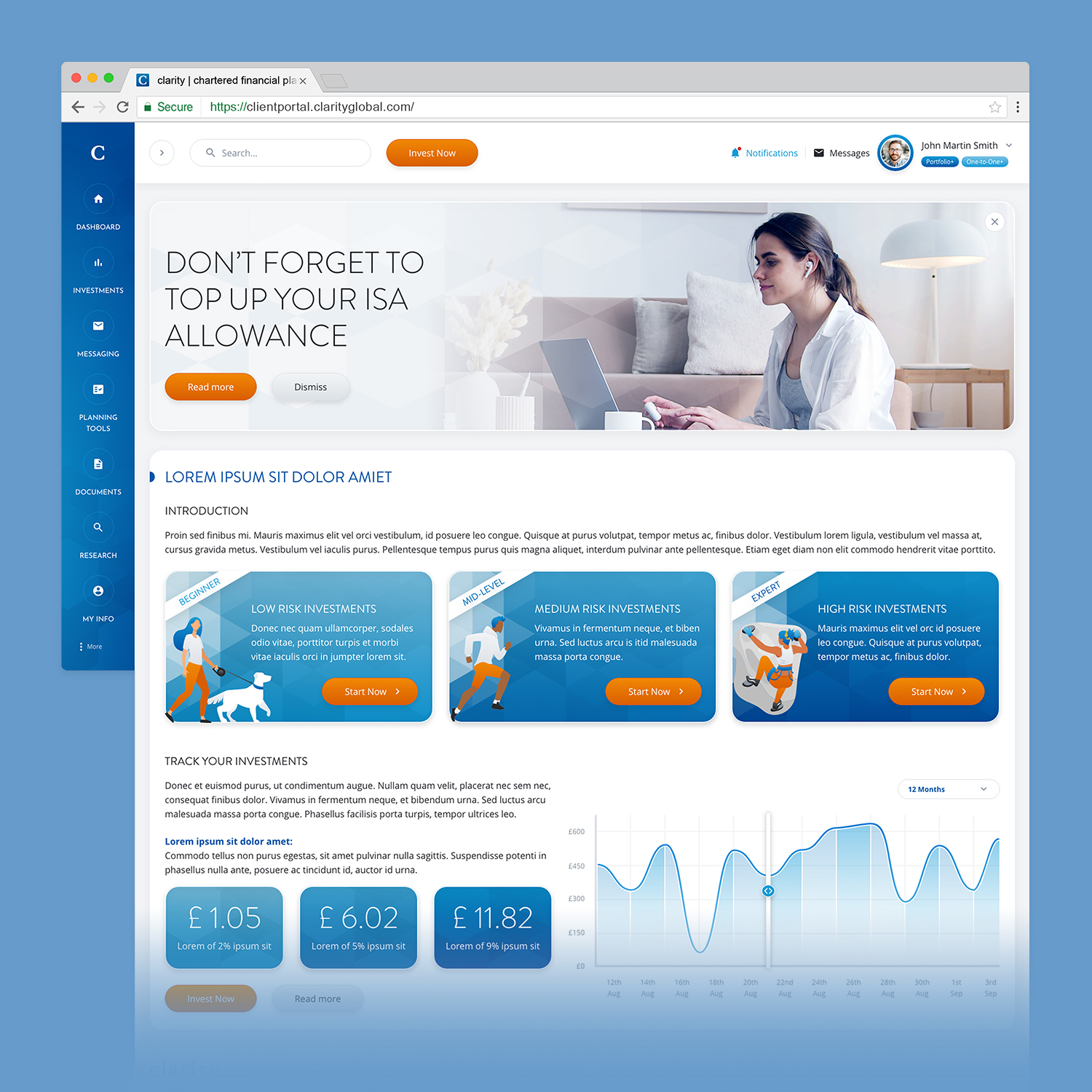
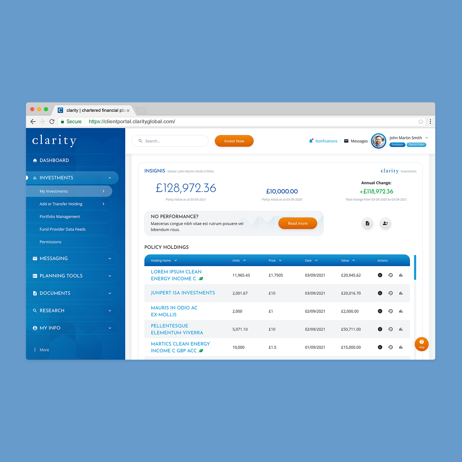
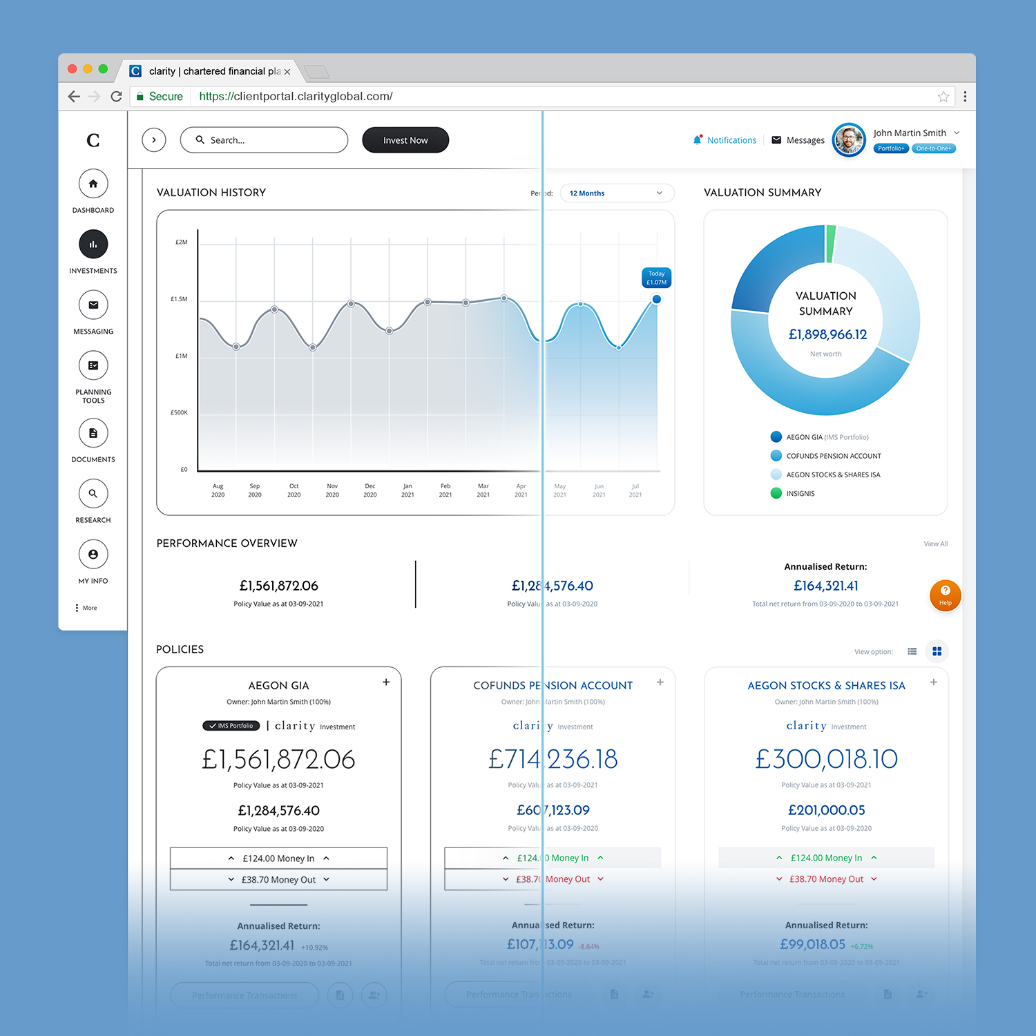
The Client asked me to design a brand new App to subsitute its old product. The new App provides access to a wealth of information and interactive tools to help users manage their money. Working as a UX Designer, for this project I've covered different tasks:
- research and analyse quantitative and qualitative data related to the users; study Competitors' products; define personas and user flows.
- supervise and coordinate developers' tasks, provide design assets, video tutorials, and interactive prototypes.
- conduct usability A/B testing and 1-to-1 meetings with users; work in Agile enviroment, provide design assets and update prototypes for future releases.
For this project I've used: Adobe Audition and Premier Pro for audio and video editing, and post-production; Adobe Illustrator and Photoshop for design assets, and photo editing; Adobe XD for prototyping. I also used Google Analytics and Hotjar to analyse users' data.
| Client: | clarity Ltd |
| Sector: | Investment / Fintech |
| Project: | UX Research and Digital Identity Redesign |
| Year: | 2021-2024 |
| Tools: | Adobe Creative Cloud (Audition, Illustrator, Photoshop, Premiere Pro, XD); Google Analytics; Hotjar |
The Beginning of the Journey
At the beginning of my journey, I conducted a Research on the main Client's Competitors and I studied their products. I also analised the basic fundaments of the Market and the main features of other Websites and Apps available, that the new App would be a valid competitor. This very first step, helped me to better understand the Market where the Client's App would be placed.
After this UX Analisys, I worked on the Personas; in this second phase, I started to study the users' data from the old version of the App, using Google Analytics. This helped me to better understand the different people that were part of the audience. With info about the current users in my hand, I then identified the new Personas the Client wanted to refer to for the new App.
In the last phase of the "Research and Analysis" journey, I created the User Flows. With these charts, I presented the main information to the users at the right time, and I identified the different paths they would take to complete desired tasks.
Design & Applications
After the Researches and Analysis I did - that helped me to spot the new Personsas and all the User Flows I needed - I worked on the template and the design. As first thing, I worked on the Sitemap, where I identified the main structure, connections between sections, and all the new pages I would design.
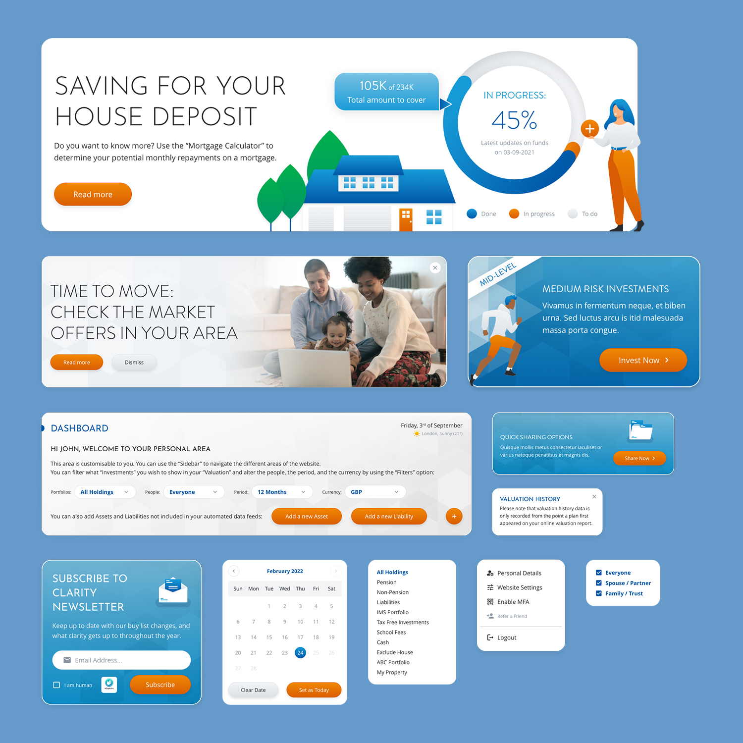
After this step, I worked on the main components and the basic templates for each page. For this purpose, I sketched the wireframes in black and white first; this helped me to put the focus on the content and arranging items on the pages - in line with their priorities. Then I presented this first concept of the App to the Client, discussing and then implementing changes and updates to the wireframes.
Once the black and white wireframes were signed off, I integrated the design and style to each components, working in Adobe XD on "High-Fidelity" prototypes (coloured and interactive screenshots of the new App). This was the final step before sharing the prototypes and all the assets with the Client's Developers.
More than This and UX Best Practices
My "Work Journey" with the Client didn't end with the delivery of the final prototypes. In fact, I was put in charge of monitoring the Analytics data available during the launch period of the new App, and I worked closely with the Client's IT Team in an Agile environment.
During this period, I suggested to my IT collegues to install Hotjar on the new App, which would help me keep track of qualitative data as well (such as heat maps). For the same reason, I also conducted one-to-one meetings with the Client's users, investigating their usage of the new App, analysing any pain points they found, and discussing any improvements and suggestions they had. All these things helped me to apply the right changes for future releases.
Accordingly with the feedback gathered during the one-to-one meetings I had, I worked on a serie of videos/tutorials - using the App recording sessions and working on the Post-Production in Adobe Premiere Pro and Audition. These videos had the purpouse to help Client's users to be familiar with the features and tools of teh new App.
If you want to know more about my UX Career, how I usually work on different tasks and how I deal with challenges (from "research" to "prototype and design"), or if you want to know more about my Best Practices, please visit this link.


