Maori
Presentation
The Client wanted to identify the Brand Identity of its new brand Maori, for the launch of new products on the Italian Pet Food market. For this project I've worked on the following tasks:
- a brand new logo: to reflect the soul and the purpose of the Maori brand;
- produce all the printed materials: such as labels for tins and bags for goodies;
- create a new responsive website: coded in HTML5 / CSS3.
For this project I've used the following tools: Adobe Illustrator for the logo; Adobe InDesign for all the printed materials; Adobe Photoshop, Adobe Dreamweaver and Wordpress for the website.
| Client: | Maori Pet s.r.l. |
| Sector: | Pet Food Sector |
| Project: | Brand Identity Redesign |
| Year: | 2015 |
| Tools: | Adobe Creative Cloud (Illustrator, InDesign, Photoshop, Dreamweaver); Wordpress |
The Logo
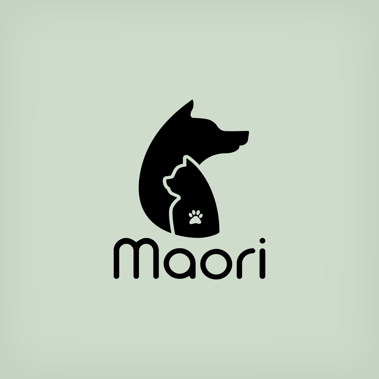
The first and main idea for the new logo came from its name: Maori. The Māori are the indigenous Polynesian people of New Zealand, famous for their tattooed bodies. And like its name, the new logo could be represented by a tattoo.
Once I've identified the style, I've found the subjects for the logo. The products branded by Maori were for both Dogs and Cats, for this reason I've chose these two animals as the main characters for the logo. I've stylised the two figure by keeping their silhouettes and I've mixed them on overlap, by adding a small animal footprint as a tattoo on the cat. I've chose a light font for Maori word and I've edited the caracter to keep it as clean as possible inside the logo. I've kept the logo in pure black to put the focus on the silhouettes.
Design & Applications
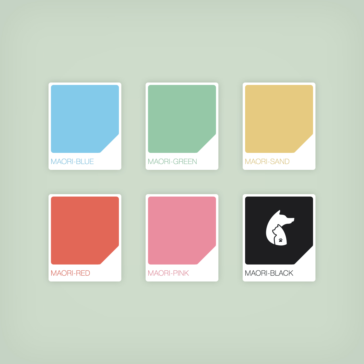
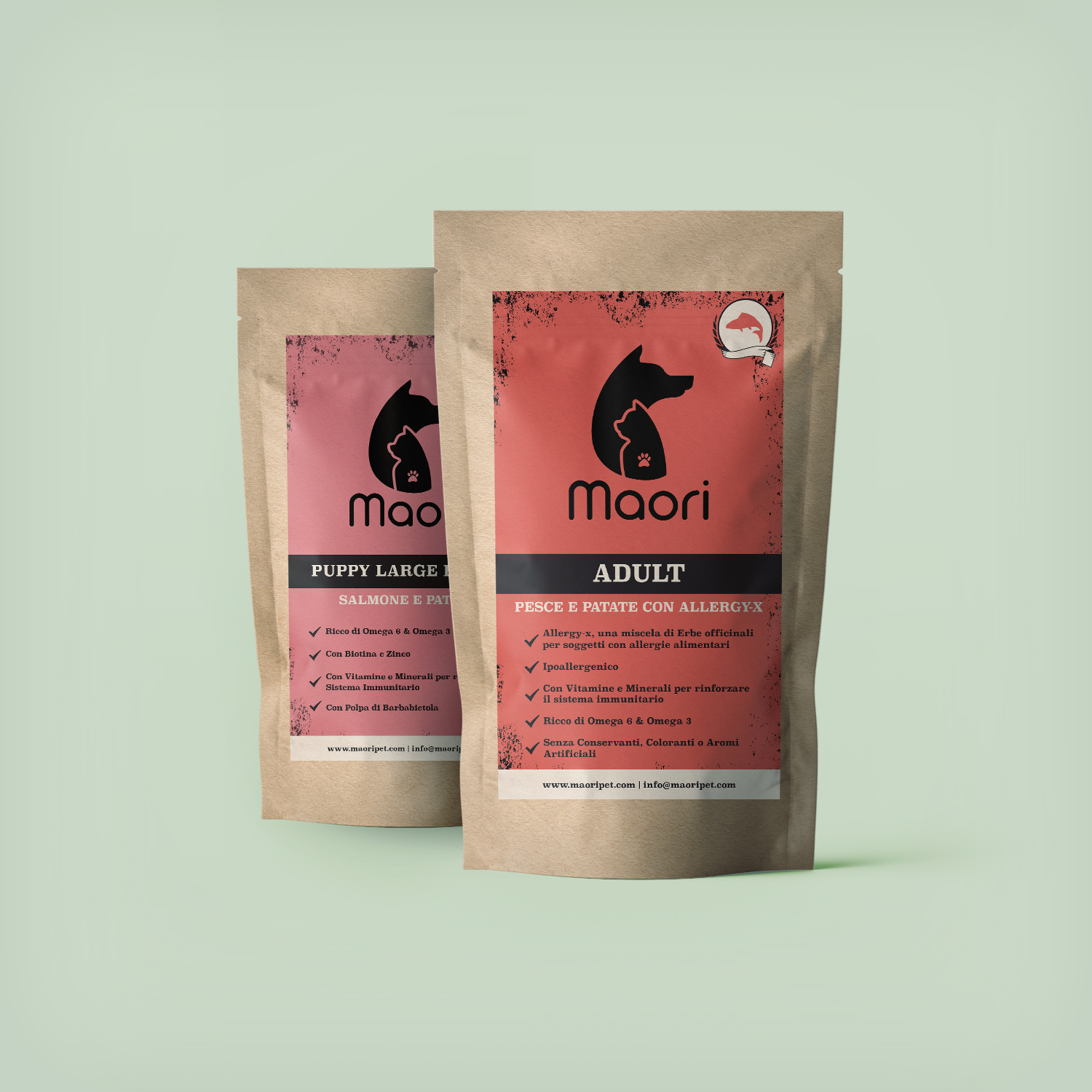
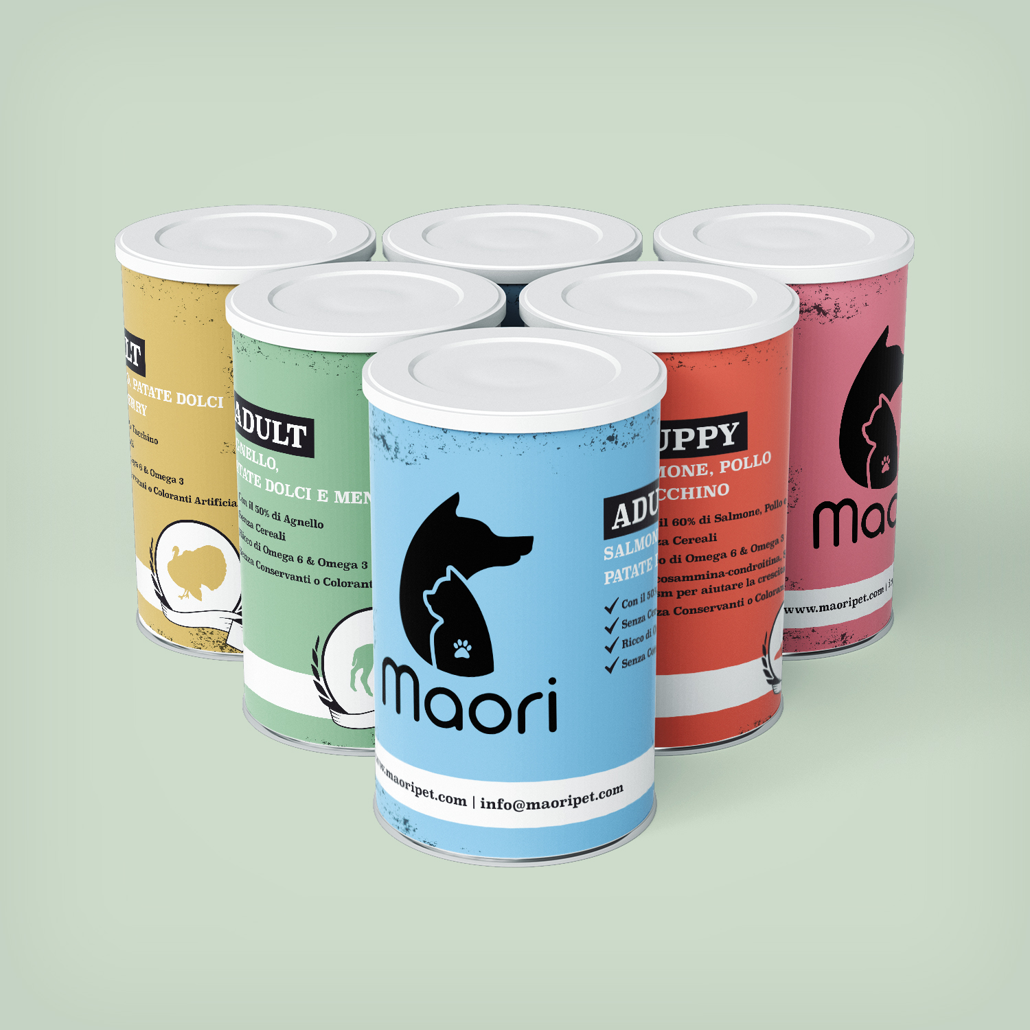
The Client asked me to design all the different labels for tins and bags with the aim to sell on the market the new branded Maori products.
With a black logo, I was free to work on coloured backgrounds for these printed creativities. I've chose a palette of five pastel colours (Blue, Green, Sand, Red and Pink) and I've used them to identify each specific category of foods (Fish, Salmon, Lamb) and each animal target age (Adult and Puppy). On the coloured background, I've set the secondary elements (animal icons, rough texture), by using only black and white as colours. In this case I've wanted to keep the design clean and highlight the idea of silhouettes impressed on labels, like tattoos on skin. Everything was made in Adobe InDesign.
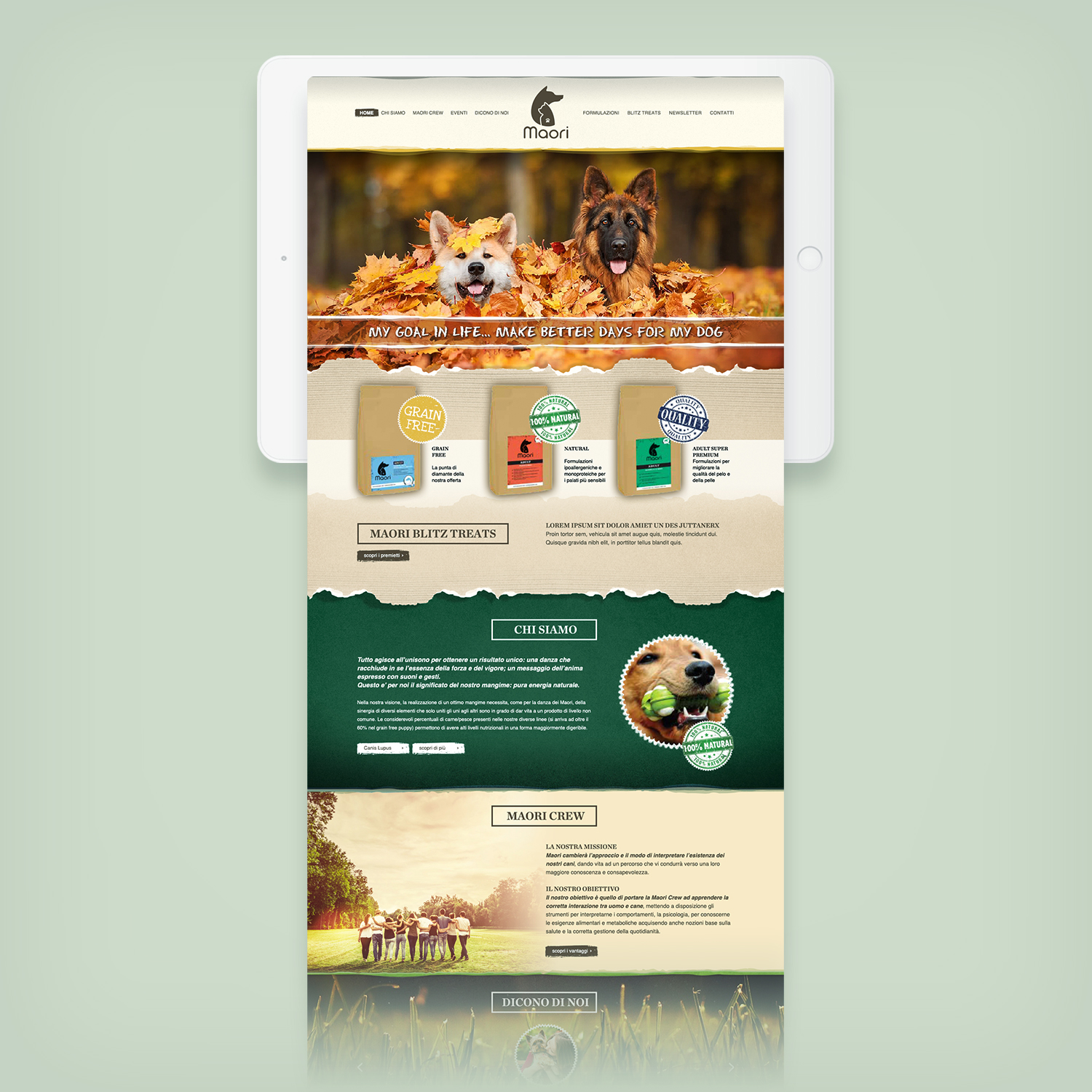
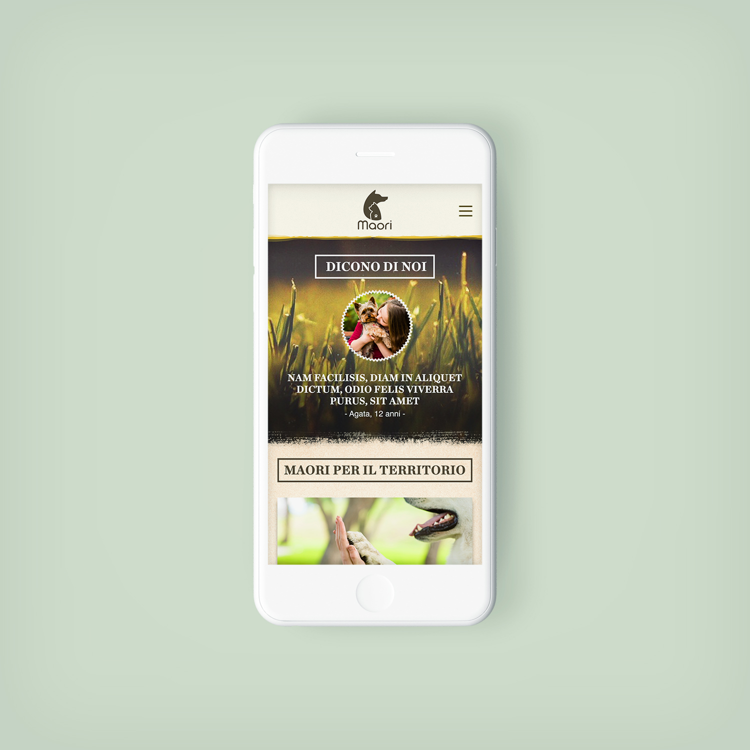
Website
The Client wanted an eye-catching and reasponsive website for the Brand, that could present the soul of the business to the users. As I did previously with the printed materials, I've wanted to replicate the same idea on the website, by highlighting the elements impressed on the screen, (again) like tattoos. And this wasn't the only idea that I've wanted to use on the site. I've also wanted to design patterns and backgrounds to replicate a paper effects on monitor (with a direct remand of the real products bags made in recycled paper).
For this website, I've designed all the main pages in Adobe Photoshop, then I've converted the design in HTML5 and CSS3, by coding a responsive template in Adobe Dreamweaver and I've setted up the new website in Wordpress.