Palaghiaccio Varese
Presentation
The Client wanted a completely new Brand Identity, to re-launch the Palaghiaccio Varese (a Multi-Sport Center) image. The project I've worked on was set on different tasks:
- a completely brand new logo: to represent the new areas gained by the new business;
- produce a new merchandise: to remark the brand inside and outside the Ice Rink;
- create a new website: by designing a good eye-catching interface (and coding everything).
For this project I've used the following tools: Adobe Illustrator for the logo; Adobe InDesign for all the printed materials; Adobe Photoshop, Adobe Dreamweaver and Wordpress for the responsive website.
| Client: | Varese Killer Bees a.s.d. |
| Sector: | Sports Sector |
| Project: | Brand Identity Redesign |
| Year: | 2016 |
| Tools: | Adobe Creative Cloud (Illustrator, InDesign, Photoshop, Dreamweaver); Wordpress |
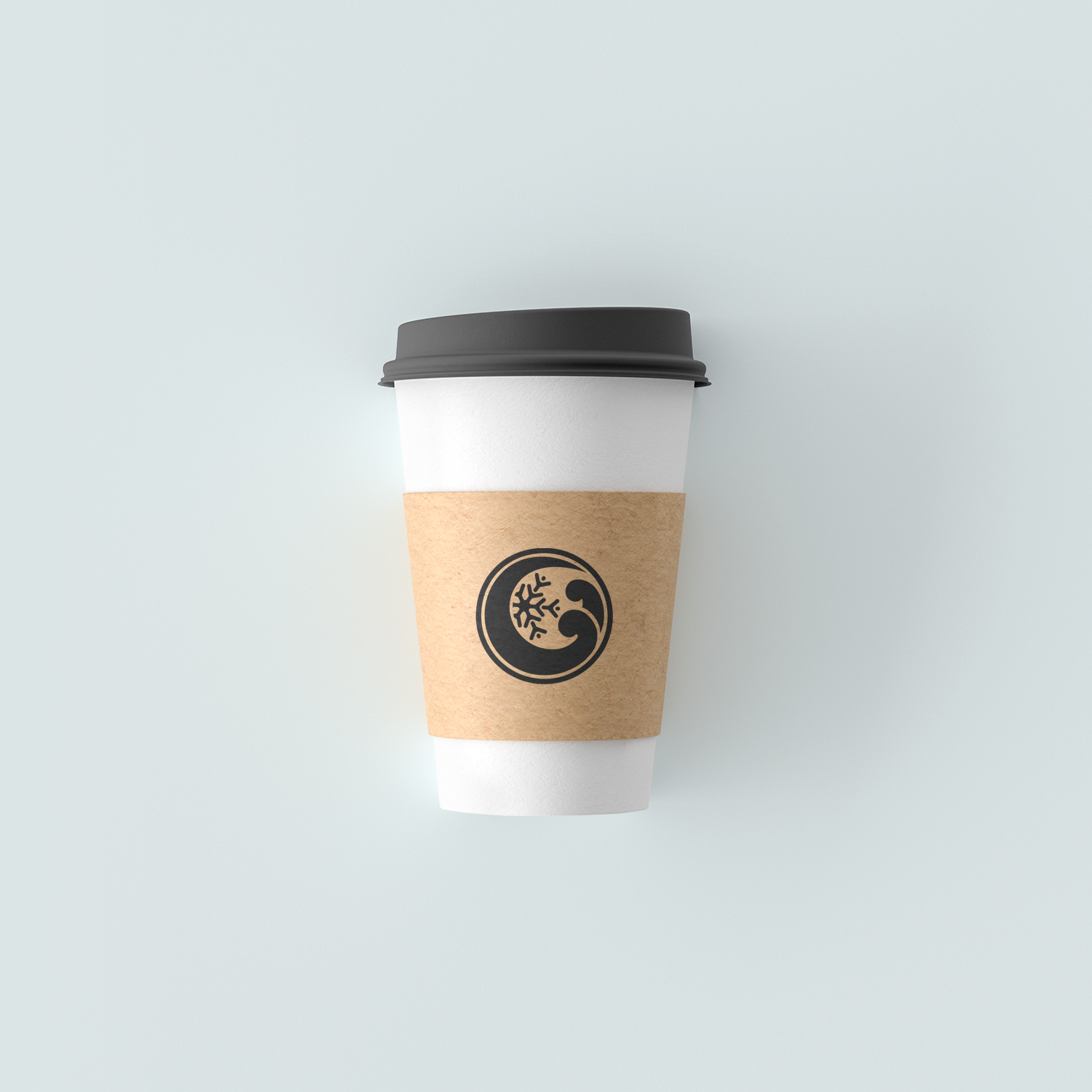
The Logo
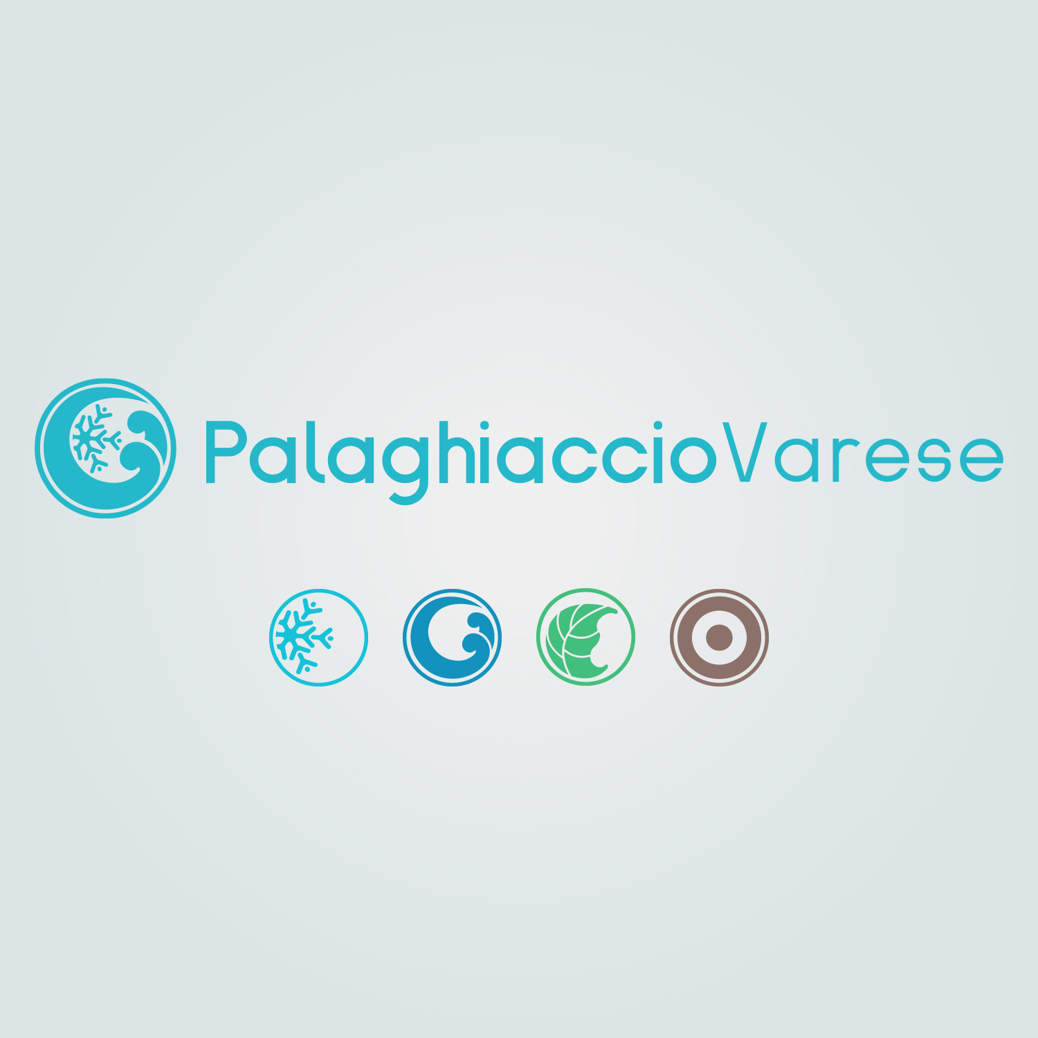
For the logo, I've started to work on the four main areas of the business, trying to "translate" these different areas in one logo (by identify each single subject first that could be merged properly toghether with the others):
- a snowflake as symbol of the Ice Rink (made in light blue);
- two waves of water as symbol of the Swimming Pool (made in blue);
- a leaf as symbol of the external Green Area (obviously in green);
- and a dumbbell as symbol of the Gym (made in brown).
Once I've identified the subjects, the final evolution of the logo was made in light blue (as the Ice Rink - due to identify the main area of the business) and the shape of it is the union of all the four symbols made before.
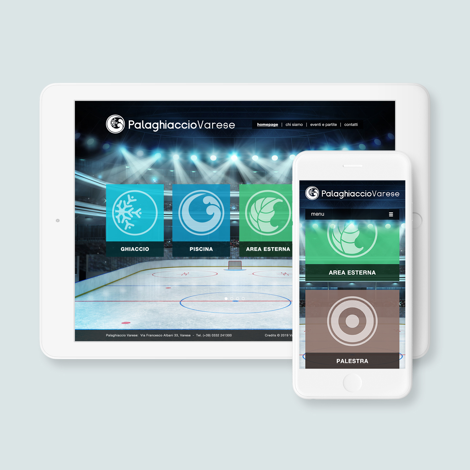
Website
The Client wanted an eye-catching website for the Brand that could present all the main areas of the business to the users. In that case I've used images of the new Ice Rink and all the other re-newed spaces as principal part of the website and I've built everything around them (in addition with the four colours and symbols identified previously for each area of the brand).
For this task I've designed all the pages in Photoshop, then I've converted the design in HTML5 and CSS3, by coding a responsive template and I've setted up the new website in Wordpress.
You can check the website online by following this link: www.palaghiacciovarese.com
Design & Applications
Four Areas. Four Symbols. Four Colours. For one Logo. These are all the elements that I've combined toghether to create the new Brand Identity.
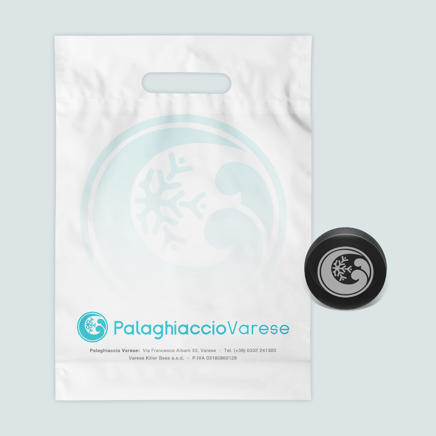
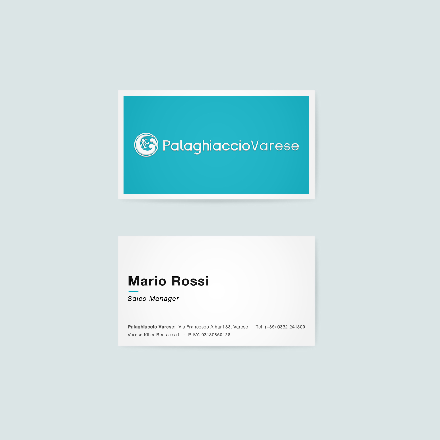
The Client asked me to design different items of merchandise with the aim to sell and distribuite them to the customers at the store inside the Ice Rink. T-shirt, bags, labels, cups and a tons of business cards are just a few items of the list. Everything was made in InDesign by using the branded light blue colour for the main design elements and the branded dark grey colour for the secondary elements.
One final application of the Brand was made inside the four areas of the Palaghiaccio Varese, where one strip of the selected branded colour was applied on the walls (one specific colour for each area, as the symbols previously identified).